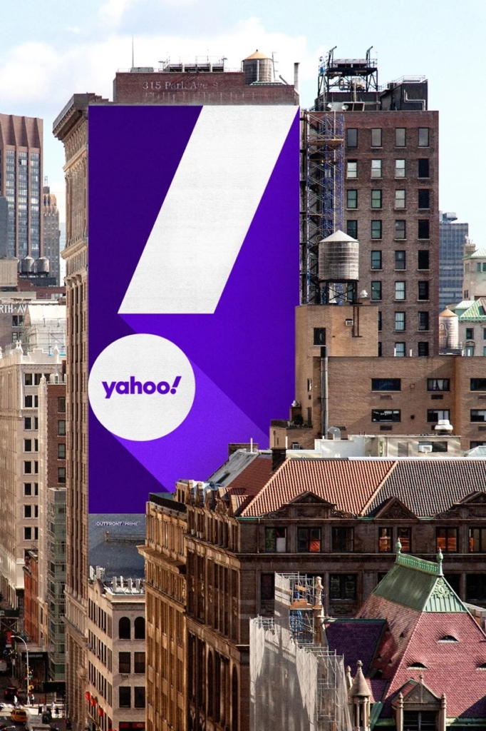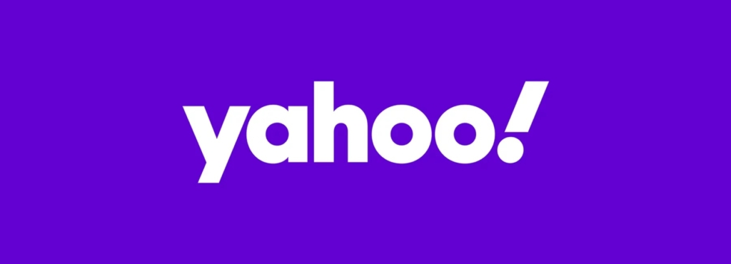
early-era internet pioneer yahoo! has updated its logo, hopefully marking a fresh start for the company. london brand agency pentagram developed the new identity, in its third redesign since 2009. the updated version keeps the iconic purple and the exclamation mark but now features a finetuned coloring and a lowercase, sans-serif type.
the result is an identity that is simpler and more flexible than its predecessor, and that looks back to the original, quirky 1996 logo.
the new wordmark is set in centra no. 2 extrabold, and the letters of the logotype have been modified to be more geometric and compact. the exclamation mark has been italicized for emphasis, as it has been in every iteration of the logo since the company’s founding.
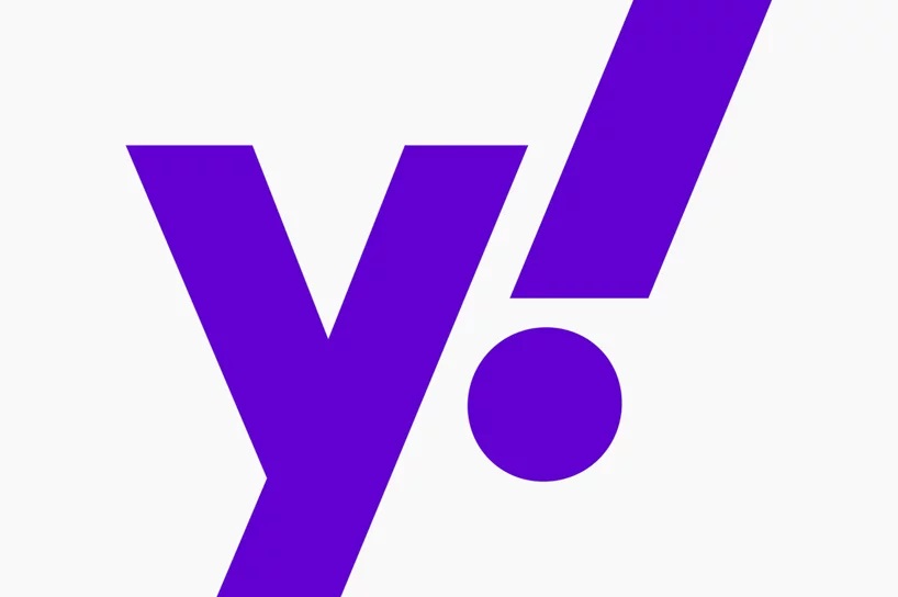
pentagram explains that “the ‘y’ and ‘!’ of the logo are both set at an angle of 22.5 degrees, a forward tilt that suggests a sense of momentum and excitement. the angle––precisely 1/16th of a circle––is the basis for visual language built around angles and incremental slices.
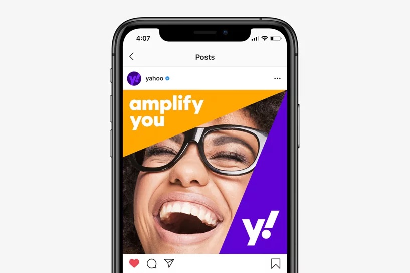
the logo keeps the color purple, yahoo’s signature color since 2003, but now features a refined palette intended to make it appear more contemporary. it includes a primary purple shade called ‘grape jelly’ and secondary purples called ‘hulk pants’ and ‘malbec’ when needed.
the pentagram designers worked with yahoo to iterate through and evaluate a wide range of options—some that were more evocative of the original 1996 logo with its offset baseline and random angles, and some that were completely new,’ adds pentagram. ‘the team conducted in-depth research with employees and stakeholders as part of the process.
as a result, the logo has been optimized to work across various platforms and scales. it is further streamlined with a simple ‘y!’ monogram, useful for favicons and social media icons. the monogram is also the foundation for a cohesive brand architecture that locks up the ‘y!’ with various channels to create sub-brands for yahoo finance, yahoo sports, and yahoo weather.
