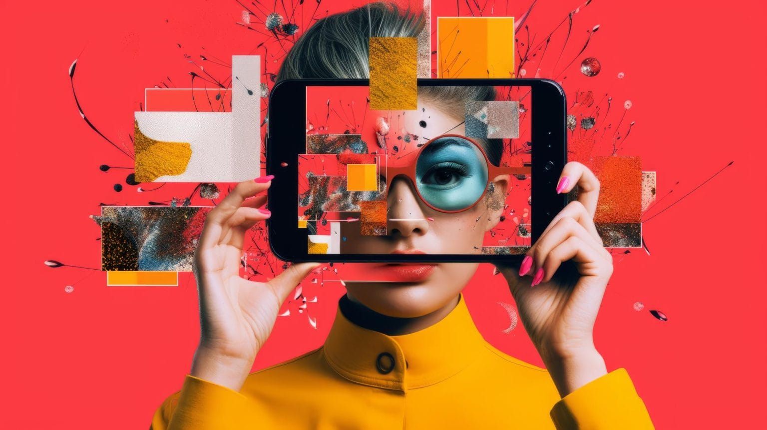
Y2K graphic design trend is back. Get inspired
Although Y2K itself was popular between 1995 and 2004, we will focus on designs from the early 2000s. In fact, since looks come into fashion again after about twenty years, we’re right on schedule!
The Y2K looks emphasize technology and futuristic looks, mainly in the form of shiny skin-tight clothes and silver-blue eyeshadow. During this time, technology such as Windows 95, PlayStation, and N64 were at their peak. Pokemon had just been released in Japan and the Spice Girls and Backstreet Boys were sweeping the nation. These years played a crucial role in the culture of 30 somethings around the globe.
Exploring 2000s graphic design trends
With the resurgence of early 2000s fashion trends, we are also seeing a comeback of sorts in Y2K design trends like Vaporwave, Grunge, and 3D Text. This era brought with it chrome, oceanscapes, tropical oranges, shiny whites and black linework, as well as designs with icy blue hues.
Like some of our 90s design trends, the musical influence of bands like the Spice Girls, Hanson, and Will Smith also played a big role in defining Y2K designs. From 2003 to roughly 2008, aesthetic trends like McBling and Frutiger Aero slowly replaced the Y2K looks, with crossover in the tech-forward motifs and celebrity influence.
Here are the top three graphic design trends of the 2000s.
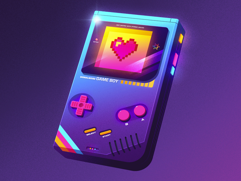
Vaporwave
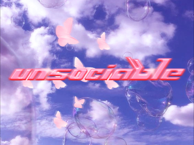
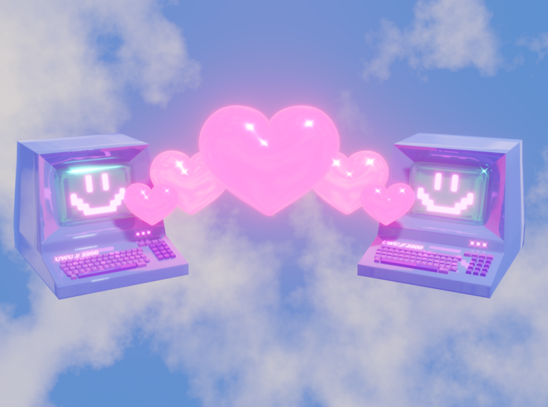
Even if you don’t know what vaporwave is from the name, you’ll sure as heck get a relatable and nostalgic vibe from these designs when you see them. Serving up tropical or futuristic scapes in mostly neon pinks, blues, and purples, this design trend also crosses over into music.
Vaporwave designs draw direct inspiration from the Memphis group of post-modern designers and architects; ’70s-‘90s anime (think Sailor Moon); drug use; Japanese language and culture; consumerism through brands like Pepsi, Microsoft Windows, Macintosh, and Arizona Iced tea; old computer OS (Windows 95); and city or tropical skylines with altered reality vibes like unnatural hues and glitches.
James White, Klara Bilić, Seth Eckert for The Furrow.
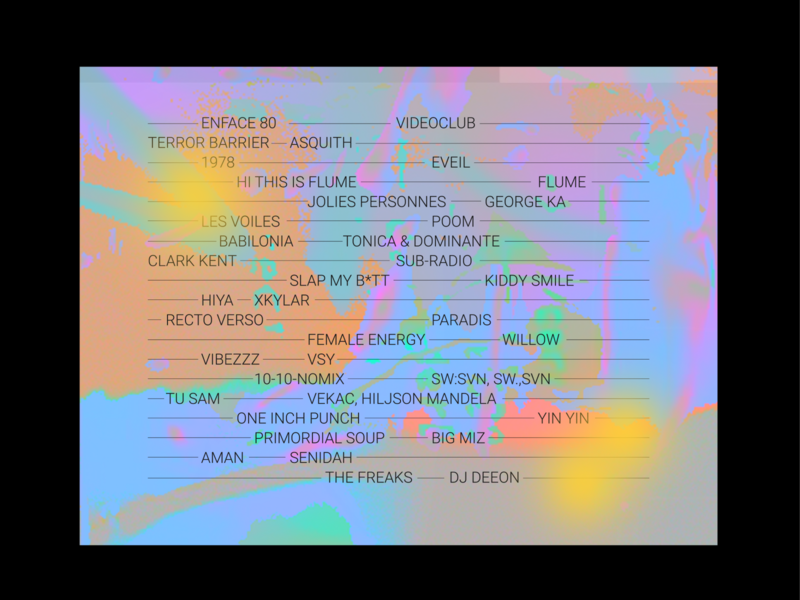
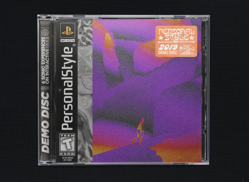
Grunge
Originating in the 1980s and becoming mainstream in the 90s, Grunge originated in the hard rock scene of Seattle, Washington. Its roots were in the anti-consumerism and counterculture that defined Gen X and was made a popular design motif by bands like Nirvana and Pearl Jam. But the Grunge we saw during Y2K was depicted in a more technology-influenced style with glitches, vinyl records, cigarettes, neon lights, and the color black.
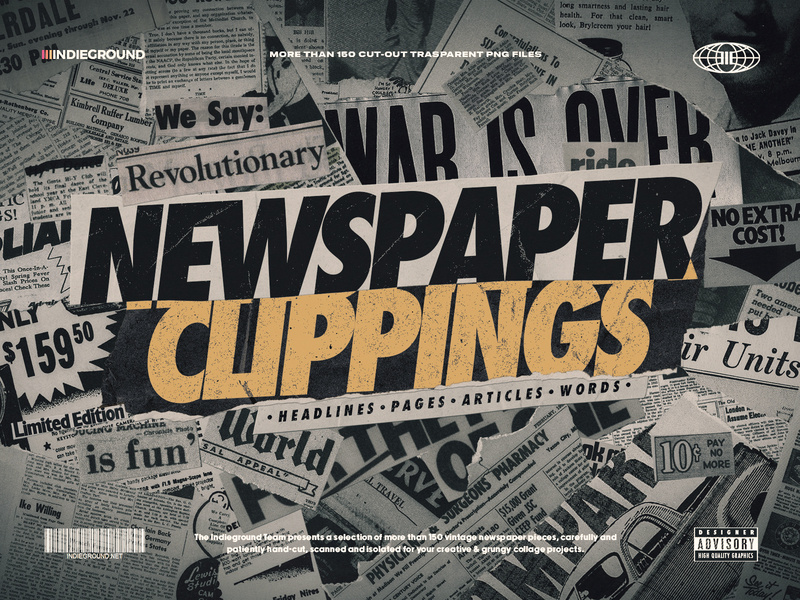
Rather than embracing the new millennium’s tech-optimism, it emphasizes the rejection of mainstream and DIY culture. Grunge graphic design breaks all the rules; with distorted fonts, authentic images, and clippings, as well as layered textures and torn edges. This can be tied to today’s “anti-design” trend, carried over from the 90s. To embrace a Grunge design style this year, ditch the white space and pristine elements.
Travis Martin, Evan Wachowski, Roberto Perrino.
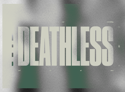
3D Effects
The infamous “Word Art” of Microsoft Word arrived along with Windows 95. Now anyone could design! This style provided a “futuristic” look at the time, likely influenced by Blobitecture buildings (or “Blobism”) built during this era.
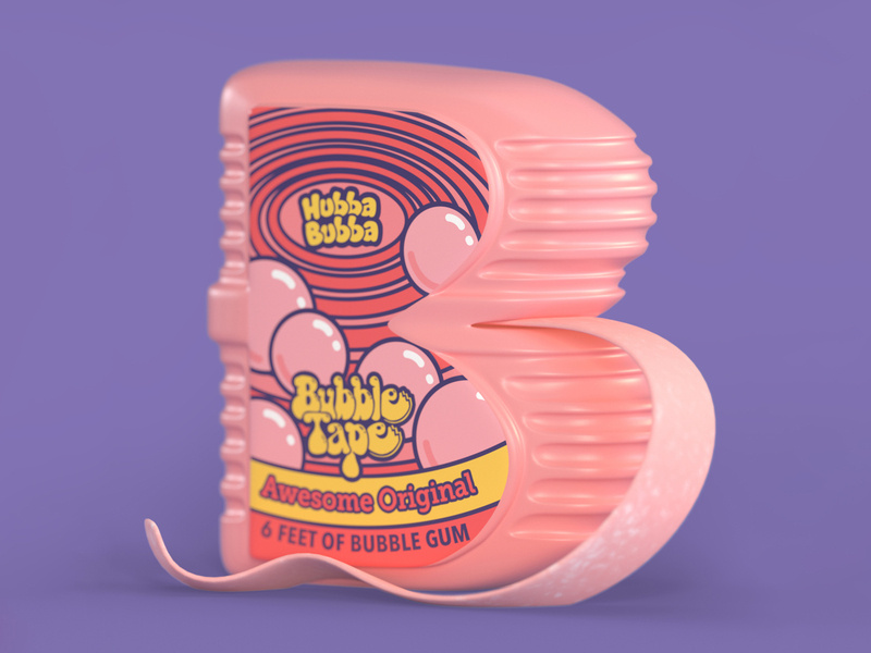
A lot of 3D effects were often used during this era, as well as large, chunky text with glitter, gradients, or heavy drop shadows for a pop-up effect. In Y2K-inspired designs, blocky text is a must. Going for bold, 3D text, and either a bright gradient or glitterati effect is a surefire way to give your designs an “early 2000s” vibe.
UNSCBL / Lanang Arief Rifqyanto, Noah Camp, Arturo Robles.
What is your favorite Y2K design trend?
That’s it for our look at the Y2K aesthetic and 00s graphic design. If you’re going for an early 2000s look, be sure to include elements of Vaporwave, Grunge, or 3D Text and you’ll knock it out of the park.
If you want to find more excellent design resources to recreate the Y2K style, head on over to Dribbble and explore these 2000s style designs. To really get in the headspace of a graphic designer from these times, pick out your best boy or raver outfit and you’ll be all set to create your futuristic, anticapitalist, 3D block text.
Olivia Hoskin
Writer & Design Enthusiast
![]() About the Author: Olivia Hoskin is a freelance writer with a background in tech and marketing. A true design fan at heart, you’ll find her writing about the latest industry trends, technologies, and the inspiring endeavors of fellow creators. She’s a champion of remote work, a lover of responsible technology, and a fitness geek and enjoyer of the outdoors in her spare time. Find her at oliviahoskin.com.
About the Author: Olivia Hoskin is a freelance writer with a background in tech and marketing. A true design fan at heart, you’ll find her writing about the latest industry trends, technologies, and the inspiring endeavors of fellow creators. She’s a champion of remote work, a lover of responsible technology, and a fitness geek and enjoyer of the outdoors in her spare time. Find her at oliviahoskin.com.
