Web Design Trends 2021: From Dark Mode to Motion
Which web design trends will take the web by storm over the next year? Our Envato experts give us their top trends to watch out for in 2021.
Web design has come a long way in the last few years. The practice exists at the intersection of creativity and technology – two of the fastest moving industries in the world – so it’s no surprise that new web design trends and techniques are constantly emerging and you should always be learning web design to stay up to date with the most recent tendencies. So what are the latest trends in web design?
While there will always be certain aspects of web design that are here to stay – such as user-friendly navigation, data security, and fast load times – fads and fashions will continue to come and go. But keeping on top of the latest and greatest web design trends, styles and innovations, will ensure your website stands out in the ever-expanding online ecosystem.
So, from dark mode to interactivity, which popular web design trends will take the web by storm over the next year? We asked our Envato experts what makes a great website in 2020, as well as their hot take on the latest and greatest web design trends to watch out for in 2021….
01. Dark mode
For a long time in web design, a white background was considered the only way to create empty space on a website or app. While some designers began adding darker themes and elements several years ago, the Dark Mode trend really took hold of the industry in 2020, and we expect to see it continue into 2021.
What Is Dark Mode?

Used by large brands like Apple, Hublot, and even for individual portfolios like Clock Strikes Twelve, dark mode is a great way to add a modern, elegant touch to any website. As well as allowing designers to play with more creative elements, such as pastels and neon – two of the big graphic design trends of 2020 – studies have also shown that dark mode is better for both our battery life and our vision by it reducing blue light exposure.
“There seems to be a shift towards more products that offer a dark mode setting, or are only dark driven, based on studies that reveal the impacts of glare and blue light exposure, and on our treasured battery life,” says Envato UI designer Sean Feehan.
As well as being sleek, chic and easier on the eyes, dark mode is great for increasing contrast, and making design elements more visible. You can even add a dark mode toggle to your website – as seen in these examples from Johny Vino, Koos Looijesteijn and Adrian Verde Studio – to allow visitors to customize their experience.
“I think dark mode is definitely the trend that’s had the biggest impact on web design in 2020,” says Envato UX designer, Tahlia Giannopoulas. “Since Dark mode has become popular, I’ve seen several websites that have a small ‘Dark Mode’ toggle (switching between light and dark mode), which is a great yet simple way that a user can customise their experience.”
While originally designed around exclusively white and light color schemes, more and more neuromorphic designs – a divisive UX style drawing on skeuomorphism and flat design that’s often seen in iOS or Android UI – also incorporate the dark mode trend, which has quickly overtaken lighter color themes in popularity.
To cross over to the dark (mode) side, check out this Dashboard UI Concept Dark Theme by hoangpts, Finance Wallet Dark Mode UI Kit PP by angelbi88 and this Spate Ui Kit by cerpow on Envato Elements!

02. Collage & Mixing Mediums
Collage was one of the biggest trends to take over the graphic design and social media landscape this year, and it’s quickly caught on in the world of web design. The mixed media style returned to the spotlight due to digital artists and social media influencers, and was also adopted by many brands and web designers – including Chobani, City Circus and Urban Outfitters.
What Is Collage?
Collage is all about mixing mediums such as photos, illustrations, graphics, motion and text to create an inspiring and eye-catching aesthetic.
Now that it’s moved into the digital realm, the collage trend has evolved into mixed media such as animated collage, large decorative fonts, artistic textures (such as paint brush strokes) and even animated distorted text, which generate some incredibly unique results.
“I think the concept of mixing mediums will only get bigger in 2021,” says Tahlia. “Heaps of people are now using drawing apps on iPads, and with digital brushes that mimic traditional paint mediums (such as watercolors, oils, gouache), the boundaries of digital art are being redefined. Also, the added convenience of having digital art already on your device (not having to worry about photographing or scanning it) means it’s easier than ever to share on the web.”
Collage is a trend that pairs well with minimal UX design – or even anti-design if you want to push those boundaries. Integrating mixed media and collage into your website design is a surefire way to add a splash of creativity to an otherwise ordinary experience and make your brand or business stand out.
To integrate collage into your next web design, check out this Brynn Creative Portfolio Theme, this Bridge – Creative Multipurpose WordPress Theme, or this Boldlab – Creative Agency Theme on ThemeForest. Or, check out these great collage-inspired items on Envato Elements!
03. Anti-Design
Warning: we know this trend isn’t for everybody!
If 2020 has taught us anything, it’s to throw all rules and expectations out the window. Anti-design is a trend that was spurred on by the resurgence of Brutalism in 2019, and the controversial style has more recently seeped into the realms of social media and pop-culture, as well as web and graphic design.
What is Anti-Design?
Described as ‘raw’, ‘unapologetic’ and even ‘hideous’, the anti design movement is all about embracing chaos and ugliness in protest of the traditional standards of ‘good’ design. It features experimental and asymmetrical layouts, exaggeration, distortion, layering and traditionally ‘ugly’ elements, which means it’s certainly not everybody’s cup of tea. But if you’re someone who likes to stand out from the crowd, there’s no denying that an anti-design website is a very effective tool for doing just that!
Many designers are now dabbling in the bizarre world of anti-design, which can be seen in the chaotic yet quirky website designs of Dutch brand Roze Bunker, and design studios Play Type and XXIX. Even Aussie artist Flume has taken a bright, bold and brutalist approach with his website. While this style always stands out (hopefully for the right reasons), effective web design is about balance. So, if you do choose to go down the road of anti-design in your UI, it’s important to ensure that the UX of your website is still simple, functional and user friendly.
“I thought the anti-design trend might die down, but I think ‘Breaking the Rules’ has evolved along with collage and mixed media,” says Tahlia. “I have come across a lot of different websites that are layering imagery, mixing serifs with san serif font, and using animation in an unconventional way. Yet, because of their great UX, they still make it work.”
If you’re pro anti-design, break the rules with this Sambat Creative Digital Portfolio HTML Template by esensifiksi, CHAOS Instagram Social Media Kit by dirtylinestudioon and this Photocopy Glitch Poster Photoshop Action by bangingjoints on Envato Elements!

04. Minimalism
A design trend that absolutely refuses to quit, minimalism has become the bread and butter of the work of web designers over the last decade. But what is minimalist web design? Less a visual style and more a design principle, minimalist design is based around using only the essential elements – such as basic shapes, clean text, limited color palettes and empty space – to create something simple, functional and memorable.
Many brands have been executing the minimalism trend beautifully in their web designs, such as luxe shoe label ETQ Amsterdam and Brooklyn-based business development agency Huge Inc. While typically associated with monochrome and white space, minimalism isn’t just black and white. In fact, colorful minimalism is on the rise in both graphic and web design, featuring block colors and bold backgrounds, simple sans serif fonts and minimalist typefaces, as well as minimal design elements to create a simple yet stunning website design.
A trend that aims to not only simplify website visual design, but usability and functionality – another big trend pegged for 2021 – minimalist web design will continue to be a key component of modern UI design for years to come.
“I’m not big on trends, but I believe that minimalism will always be relevant in the digital design space,” says Sean. “The more we overcomplicate our interfaces, the more users will struggle to use our products.”
To keep it simple with minimalism, check out this Breal Minimal Website PSD Template by VLThemes, Uniqlo Minimalist eCommerce Template by codecarnival and this Minimal Website Landing Page by cerpow on Envato Elements!


05. Organic Design
One of the biggest design trends of 2020, organic design is all about using nature and the world around us as inspiration. While frequently seen in product design, interior design and graphic design, this trend is now starting to gain momentum in the world of web design too.
The Organic design trend is influenced by an increased focus on sustainability and environmentalism, featuring warm, earthy colors, natural shapes and raw organic textures – as spotted on these websites from Ora Floral Agency, A Better Source, and Melbourne’s Abbotsford Convent.
Neutral colors replicate our environment’s natural palette, and are one of the easiest and most effective ways to add a more organic feel to your website. Alongside soft browns, beiges and whites, faded pinks, blues, and greens can also be great additions to a neutral color palette, which can be used on their own or paired with brighter colors to make them pop.
“I have noticed quite a few websites shift towards earthy warm color palettes, which is a welcome change from the bright cool tones we usually see dominating our screens,” says Tahlia.
To get back to basics with organic design, check out this Mirabilis Portfolio Photoshop Template by Amabile, Portfolio Creative Lookbook by dirtylinestudio, or this Natural Shapes & Scenes Collection by pixelbuddha_graphic on Envato Elements! Or, step inside our Earth Tones collection.


06. Illustration
Illustration has absolutely exploded this year across graphic design, social media and web design. Plenty of brands, businesses and creators are catching on to the popularity of illustration and digital art, with many now integrating hand-drawn elements into their website designs – including the likes of health insurance company AHM and even luxury fashion brand Gucci.
Following on from organic design, illustrations are great for adding a crafty, authentic touch to your web design and give your website a welcoming feel. With an increased focus on diversity and representation in design in 2020, many illustrators are now featuring quirky people of all shapes and sizes, a style commonly referred to as “odd bodies”.
3D illustrator and Elements author Amrit Pal Singh is a big advocate for these more quirky and inclusive illustrations, focusing on diversity, individuality and representation in his work.
“Illustrations and character design over the years have really established wrong standards of beauty and importance. Almond-eyes, fair skin, and particular body types; we have grown up watching cartoons that establish these biases,” says Amrit. “As creators and artists, it’s our duty to fix that. We need to consciously think about representation at every stage. I’m always trying to make my work more diverse and inclusive.”
To integrate illustration into your web designs, check out this collection of 3D illustrations. Or take a look at these Pride Character 3D Illustration Toy Faces by amritpaldesign, this Taruih Sign Up Header by usedesignspace, and this Marketing Flat Illustration by roundicons on Envato Elements!

07. Functionality, Inclusivity & Accessibility
Website functionality has always been a key aspect of web design. However, along with fast load times, page speed, and mobile-friendly design, an increased focus on inclusivity and accessibility have created a growing need for web design to factor in the needs of people with disabilities, and make websites accessible and functional for all.
Luckily, accessible web design is being adopted by more brands and businesses – such as e-commerce hub Blue Receipt and no-fuss cat food brand Cat Person – and having a functional, accessible and user-friendly website that any visitor can easily navigate is now essential for providing an effective online experience.
Optimizing your website to be more functional, accessible and inclusive is not just good for customer service – it also increases conversion, boosts your SEO, and extends your audience reach.
Some ways to make your website more inclusive and accessible include:
- Creating strong color contrast between text and backgrounds;
- Adding focus indicators, such as the rectangular outline that shows up around links when using keyboard navigation;
- Using labels and instructions with form fields rather than low-context placeholder text;
- Using functional alt tags for images;
- Featuring easy-to-understand, straightforward, and jargon-free copy.


“On the whole, I have seen a real raising of the bar in well designed, functional, accessible websites which is really positive,” says Sean. “I’ve observed this through higher contrast colours, large typography, authentic, relatable copy, big buttons, and soft curved UI elements. I somewhat optimistically believe this is due to a growing understanding and appreciation of the value good design can add to businesses.”
To make your web designs more functional and inclusive, try this Accessible Business Portfolio & WooCommerce WordPress Theme, Product Designer WordPress Theme for WooCommerce or this Voicer – Text to Speech Plugin for WordPress on CodeCanyon. Or, check out more items below on Envato Elements!
08. Motion & Interactivity
Video is proven to be the most engaging form of content online, so it’s no surprise that motion has also become a big trend in web design. Used everywhere from boutique websites such as Alter Mind and Gridspace to SEEK’s career advice page, motion and animation in web design is a simple way to make an otherwise ordinary web page more exciting and engaging.
In a similar vein, many brands and businesses – such as YouTube Rewind – have begun adding more interactive elements to their websites, including quizzes, games, polls and surveys. A great example is Estee Lauder, whose website features an interactive arcade game called ‘THE ANRCADE’ – a futuristic quest focused on earning ‘youth-generating power points’ to promote their Advanced Night Repair cream.
In addition to being a fun addition to the online experience, interactivity is a great way to engage your visitors while also learning more about them. However, it’s important to achieve balance and ensure your motion or interactive elements don’t dominate or distract from the purpose of your website.
“As technology continues to improve it is becoming easier to utilize and apply motion to your designs, which can make for delightful experiences (when used appropriately),” says Sean. “I see this done well when transitioning between content, and interacting with elements.”
To add more motion and interactivity into your website, check out this Lottie Animation for Elementor by merkulove, Animated Typography by motionbeard, and this Scribble Elements by FlashFXbox on Envato Elements!

09. 3D & Geometric Design
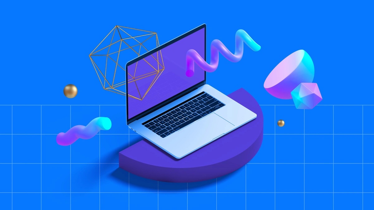
Geometric patterns and elements are frequently used in the world of modern web design – including classic flat shapes such as polygons, diamonds, rectangles, triangles, and the occasional rhombus. However, the geometric web design trend has evolved to also include more modern elements such as 3D shapes, floating objects and visible gridlines.
The use of 3D shapes and floating objects in geometric design blends surreal motion with realistic objects, creating a mesmerizing, futuristic effect – a style popularized by the suspended, rotating movement often used in tech commercials to show off new products. This is perfect for adding another layer or dimension to your web design, to ensure your website captivates your visitors – as seen in this website by The Artery, which pairs geometric elements with minimalist, simple gridlines to lay out their website.
In contrast to the complex nature of 3D and floating objects, the use of simplic grid lines, borders and other structural elements has also become a trending style in the web design space – such as in these websites by Rail Road Ladies, Monograph Comms and The Imagineers.
“I’ve also noticed a resurgence of more geometric elements and visible grid lines in web design, which I’m kind of into as someone who loves structure and order,” says Sean.
To get geometric with your web designs, check out our 3D Objects Collection and Floating Objects Collection on Envato Elements. Or try out this Connected Landing Page by cerpow, Liquid color background design by graphics4u and this Oscar Template for Startups, Portfolio & Agency by designova!
10. WordPress Page Builders & Template Kits
In the last few years, self-serve website templates and page builders have increased in popularity. Website builders such as Elementor and WordPress Gutenberg mean that, nowadays, even the least tech-savvy or design-minded person can create a professional website in no time.
Page builders are fast, code-free and fully flexible, offering professional layouts and limitless customization for those without design or coding knowledge.
With a little something for everyone, Envato Elements Template Kits for Elementor offer a wide variety of professional and cohesive website designs and templates for everything from your homepage to your contact page. Envato’s new category of pre-designed templates are designed to go hand-in-hand with your WordPress page builder – which makes it super easy to get a website up and running in no time.
To build your own WordPress website, check out these top 10 Template Kits for Elementor, or try out some of the Template Kits below…
We hope you enjoyed our collection of Web Design Trends for 2021. Want more? Check out our UX and UI trends 2020 roundup, Web Design Trends for College & University Websites, WordPress Themes for an Election Campaign, Marketing Trends and Social Media Trends Predictions for 2021 on the Envato Blog!


