The Designer of Nirvana’s Nevermind Cover on Shooting Babies and Working with Kurt Cobain
“I was hired as a designer out of art school and I worked my way up to an art director position. I was excited when I heard that Geffen was going to sign Nirvana, so I went and asked if I could work on it. Nobody at the label had any idea it was gonna be that big. But once I got the advance cassette copy I was blown away.”
After meeting with the band, Fisher learned that Kurt Cobain already had a vision for the cover.
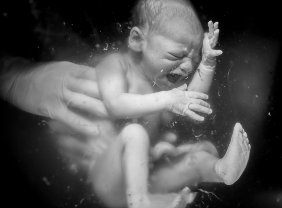
Photo: Caroline Devulder.
“Kurt wanted a baby being born underwater. Back then before the Internet you would have to go down to the local bookstore and go through child birthing books and try to find photos. So that’s what I did. But it was just like … there’s no way we can make an album cover out of this. I couldn’t find any really good pictures and they were all way too graphic to use.”
After ruling out the childbirth idea, Fisher started exploring other options featuring babies underwater. But he realised the image needed something else.
“We thought ‘Ok, we’ve gotta make it more than just a baby underwater’. So Kurt came up with the idea of adding a fishhook to make it more menacing. We spent the afternoon sitting around thinking of all the funny things we could put on the fishhook. One idea was a piece of meat, like a big raw steak. Another was a CD or something to kind of symbolise music. We went to lunch and we were like ‘How about a burrito?’ ‘Oh there’s a dog, what about a dog?’ … it just went on for hours. I don’t remember who said dollar bill but everyone was like ‘That’s pretty good,’ and that’s what it ended up being. The thing with the whole process … Kurt didn’t come with like a grand plan or a message he wanted to get across. It all kind of came together organically you know, it was like one step led to another step that led to another.”
Now that he had a concept, Fisher needed to find a photographer to execute it. He soon found the perfect person: Kirk Weddle.
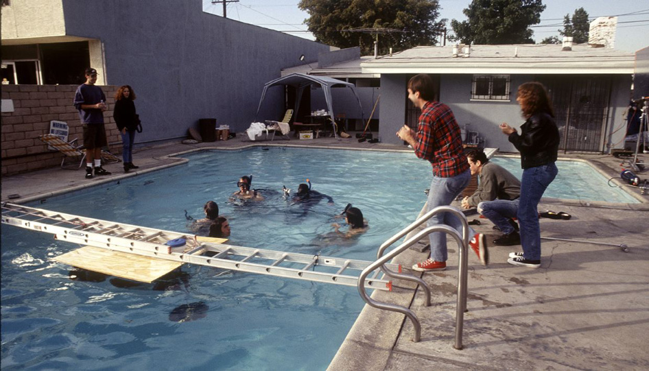
Underwater photo shoot with Kirk Weddle and Nirvana. Left: Art director Robert Fisher. Photo: Rolling Stone.
“They used to have these things called work-books — big thick catalogues where photographers would buy a page or two and they’d send them out to creatives to try and get work. And this one guy in there, one of his tag-lines was he specialised in ‘submerged humans’. I thought ‘That’s our guy!’. That was Kirk Weddle.”
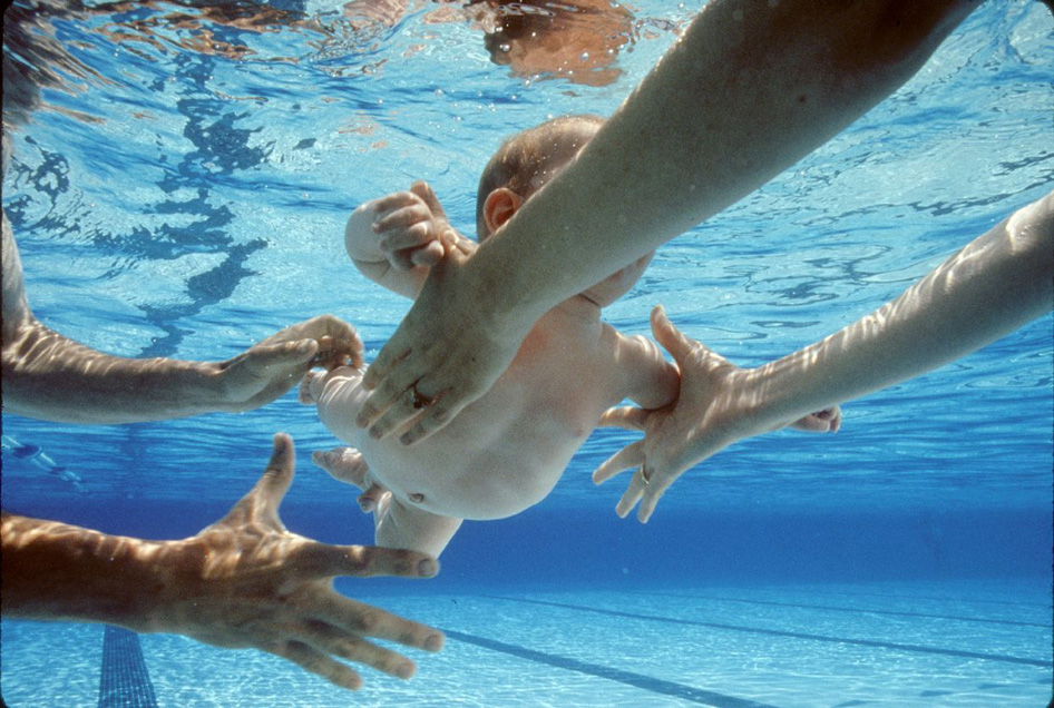
Parents pass a four-month-old Spencer Elden between them. Photo: Kirk Weddle.
“We hired Kirk to shoot the photos at the Pasadena aquatic centre. He got four or five different parents to come down and lend us their babies and take turns passing them in front of the camera. If you look closely at the final image you can see the parent’s handprint on the baby’s chest where they were holding it right before they passed it.”
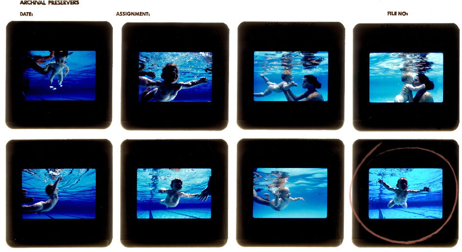
Proof sheet from the underwater shoot. The team used a doll (top left) for test shots.
“A week later I got a couple of proof sheets back, maybe 40 or 50 shots. There was just one that was absolutely perfect. The positioning, the look on the baby’s face, the way that his arms were stretched out like he was reaching for something — everything about it was just perfect. That’s the one I picked.”
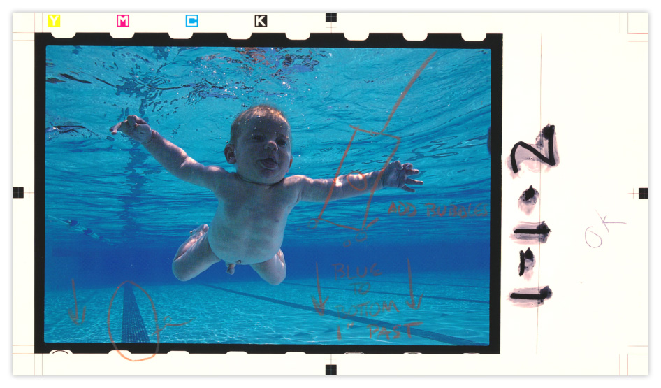
The marked up photo outlining the elements to be added or changed.
“Back before computers you used to have guys sitting in dark rooms getting paid lots of money to do what we do now in Photoshop. We had to get the photo scanned and then you would mark it up with pencil to show what you wanted done, like ‘Add a dollar bill here,’ or ‘Put some bubbles here, take out the bottom of the pool.’ Then you’d send it off, and in four or five days you’d get it back. You’d open the envelope like ‘Ohhhh!’”
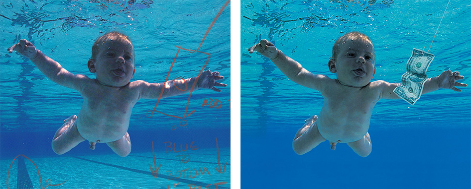
Left: The marked up photo. Right: The final composite image.
“I went to the bait and tackle shop and got some fishhooks. I sent the photographer those with a couple of polaroids of how I wanted the dollar bill to look. Then I sent those photos to the colour separator and they scanned them and put them in.”
With the photo complete, it was time to add the other elements to the cover.
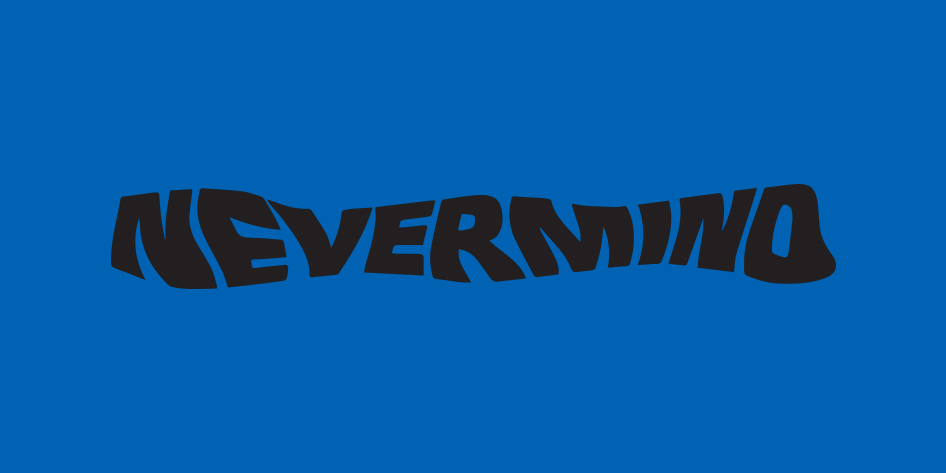
“I wanted the word Nevermind to look kind of underwater and wavy. So I had the type printed out and I held it on a Xerox machine. As it was scanning I wiggled the image and it put waves through it. Then I scanned it again and wiggled it in another direction. That’s how I got the wavy type. Now you’d just go on a computer and use filters or whatever, and people say the wavy type is kinda cheesy. But back in the day it was groundbreaking damnit!”
With the addition of the type and the band’s existing logo, the final cover was complete.
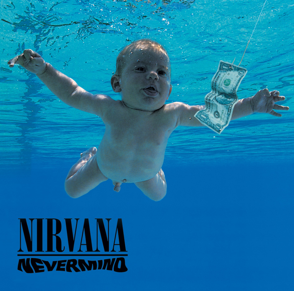
“I remember the first time I saw it with all the type on it and everything … it was perfect. I was so happy with it. When I showed the final cover for the first time to the band and management, they loved it and didn’t have a single change. Nirvana was such a great band and the two together just made magic I guess.”
For more classic album art, you can follow Robert Fisher on Instagram.
