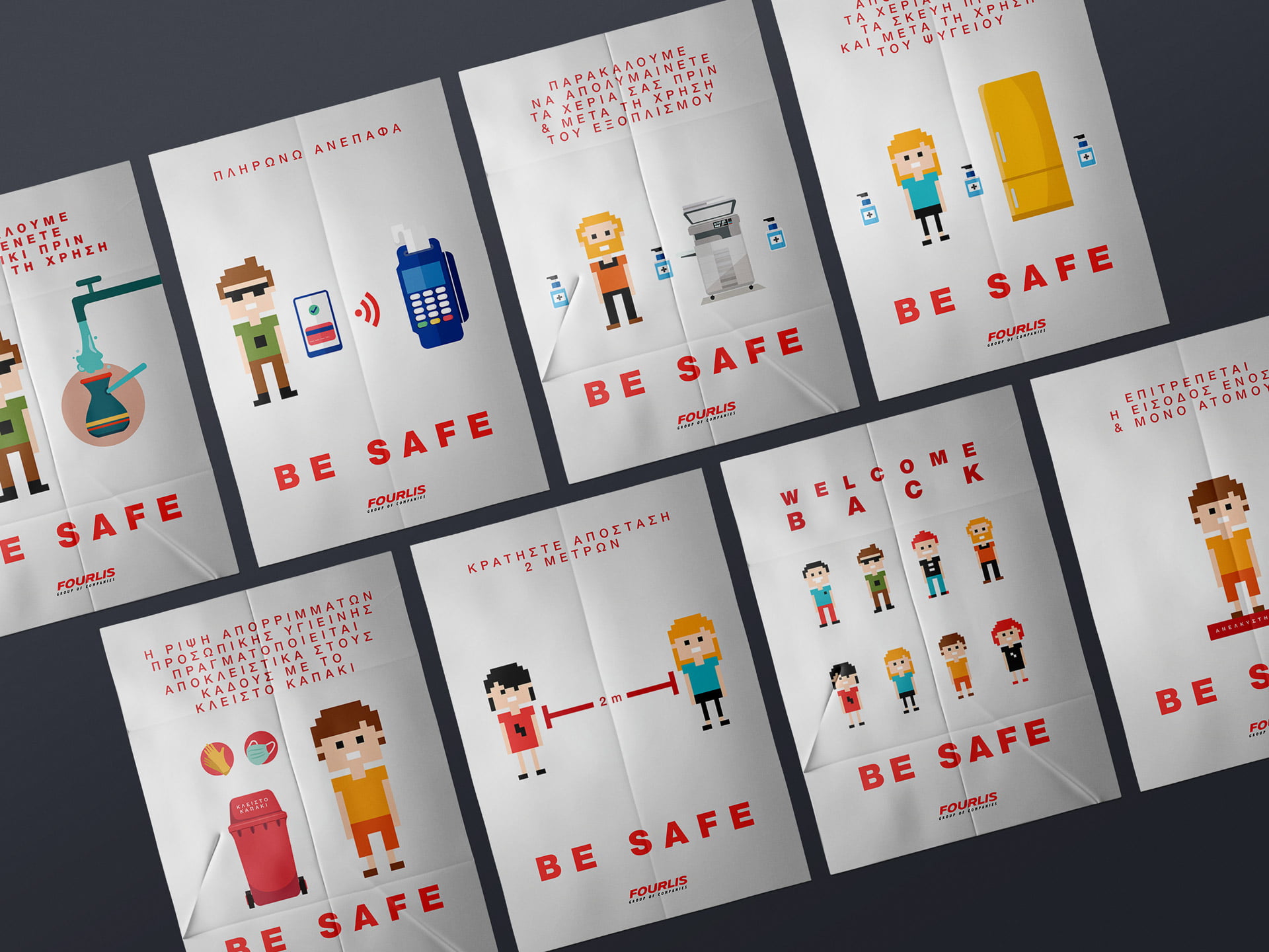
Poster Series: FOURLIS GROUP COVID-Era Poster Campaign – “Be Safe”
Design Theme: Minimal Pixelated Characters
Project Overview: In response to the ongoing challenges presented by the COVID-19 pandemic, FOURLIS GROUP’s HR department commissioned the design of a unified poster aimed at reinforcing essential safety protocols across their workplaces. The primary goal was to create a visually engaging and easy-to-understand poster that would remind employees of critical health and safety practices while maintaining a welcoming and positive tone.
Challenge
Design Concept: The design centered around a minimalist, pixelated character theme.
This approach was chosen for its modern, approachable aesthetic, which effectively conveyed the seriousness of the safety messages while remaining visually appealing and accessible. The use of pixelated characters allowed for clear, simple representations of various workplace scenarios, making the poster both informative and engaging.

Goal
Design Concept: The design centered around a minimalist, pixelated character theme.
This approach was chosen for its modern, approachable aesthetic, which effectively conveyed the seriousness of the safety messages while remaining visually appealing and accessible. The use of pixelated characters allowed for clear, simple representations of various workplace scenarios, making the poster both informative and engaging.

Result
The rebranded company experienced increased customer engagement, a boost in sales, and a stronger brand presence in the market.
The comprehensive initiative, extending beyond visual changes, resonated authentically with the audience, resulting in heightened engagement metrics and a tangible boost in sales. The company now stands on a more robust foundation, embodying a stronger and more compelling brand presence, setting the stage for continued success in the competitive market.
Shaping comprehensive brand narratives for enduring impact.
Shaping comprehensive brand narratives for enduring impact.
