Nissan latest car brand to roll out flat logo
Japanese car brand Nissan has joined BMW, MINI and Volkswagen in officially replacing its three-dimensional emblem with a flat, two-dimensional logo.
The company name has been kept at the centre of the logo, but is no longer raised and has been simplified into basic, block lines. The font has also been refined and the lettering stretched out to create more in-between space, offering a cleaner aesthetic.
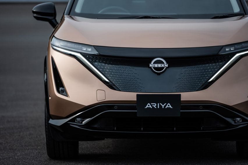
Nissan‘s debuted its new logo on the electric Ariya SUV and all of the brand’s future fully-electric vehicles will feature an illuminated version of the design.
This will be lit by 20 LEDs – a number chosen to represent the number of years since the last logo redesign.
The logo, which has been three years in the making, was initiated in 2017 by Nissan’s senior vice president of global design Alfonso Albaisa.
Albaisa set up a design team led by Tsutomu Matsuo with the brief of updating the company’s brand identity to something “thin, light and flexible”.
“Inspiration was drawn from breakthroughs in science, technology and connectivity,” said Albaisa. “How these have brought fundamental changes to customers. As you can imagine, visions of digitalization started swirling in our heads.”
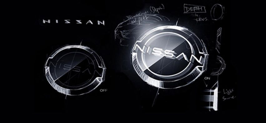
The need to illuminate the logo on Nissan’s logo on upcoming all-electric models presented the team with technical challenges, including correctly judging the thickness of the emblem’s outline in order for it to create a “crisp” finish when lit up, in addition to complying with government regulations.
It also needed to retain its bold presence when not lit-up – when used digitally, on paper or by dealerships.
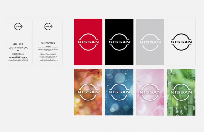
The team began the design process in 3D, drafting the illuminated brand badge first, before developing it into a flat, 2D form to represent the brand across the rest of its platforms.
“The overall effect of the redesign is a transition from a hard-edged, industrial feel to a refined, familiar and digital-friendly look,” said the car maker. “Nissan’s new logo symbolizes the company’s dedication to keep innovating for new generations of customers.”
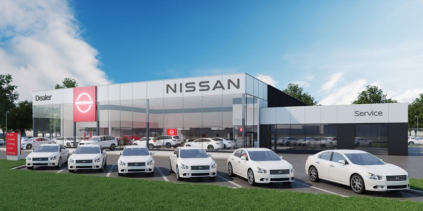
This is the first time in 20 years that Nissan has changed its visual identity. The previous overhaul saw it update the brand’s original logo with a three-dimensional version.
The original logo was created when Nissan took control of DAT Motors (formerly known as Datsun), which was based on the mantra held by founder Yoshisuke Aikawa that “if you have a strong belief, it penetrates even the sun.”
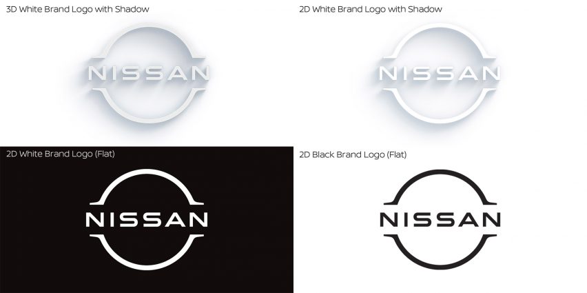
Leading on from this, the logo was made up of a red circle intercepted by a blue rectangular section printed with the Nissan name. This also represented Japan’s flag.
“The new Nissan logo communicates our guiding message, carried over from past iterations: If you have a strong, determined belief, it can even penetrate the sun,” said Matsuo.
“At Nissan, this strong belief in the power of achievement has never wavered and can be seen in our pioneering efforts in electrification, driver assistance and digital connectivity,” he added.
“Our logo has to convey all of this in just a glance, to show our commitment to our customers, employees and society.”
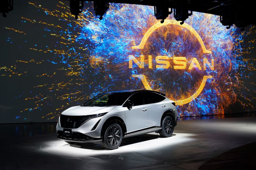
Four iterations of the logo have been designed to best suit it to different purposes. These include a 2D white logo and a 2D black logo, a well as a 3D white logo with a shadow-effect and a 2D white logo with shadow.
Animated versions of the logo will be featured online that will “come alive”, moving and pulsating against various backgrounds in a bid to reflect “today’s ever-changing environment”.
The new logo bears a resemblance to other two-dimensional emblems created by automotive brands looking to better suit their visual identity to a digitally-focused world.
“Our lives are as much digital as they are physical,” said Nissan. “Hence strong brands need to have effective touchpoints in both realms.”
This includes BMW, which replaced the original black outer ring surrounding its logo with a transparent ring, meaning it will take on different colours and patterns depending on the background against which it is placed.
[vc_row custom_css_code=”LndwY2Y3LWZvcm0lMjAuZ2VtLWJ1dHRvbiUyMCU3QiUwQSUyMCUyMCUyMCUyMGZvbnQtc2l6ZSUzQSUyMDE2cHglM0IlMEElMjAlMjAlMjAlMjBib3JkZXItcmFkaXVzJTNBJTIwMCUzQiUwQSU3RCUwQS53cGNmNy1mb3JtJTIwaW5wdXQud3BjZjctdGV4dCUyQyUyMCUwQS53cGNmNy1mb3JtJTIwaW5wdXQud3BjZjctZW1haWwlMkMlMEEud3BjZjctZm9ybSUyMHRleHRhcmVhJTIwJTdCJTBBJTIwJTIwJTIwJTIwJTIwYm9yZGVyJTNBJTIwbm9uZSUzQiUwQSUyMCUyMCUyMCUyMCUyMGJhY2tncm91bmQtY29sb3IlM0ElMjAlMjNmZmYlM0IlMEElN0Q=”][vc_column][gem_fullwidth background_style=”cover” container=”1″ background_image=”32627″][gem_divider margin_top=”110″][vc_column_text]
[/vc_column_text][gem_divider margin_top=”-5″][vc_column_text]
[/vc_column_text][gem_divider margin_top=”60″][vc_column_text]
[/vc_column_text][gem_divider margin_top=”-10″][vc_column_text]
[/vc_column_text][gem_divider margin_top=”80″][gem_divider margin_top=”30″][vc_column_text]
[/vc_column_text][gem_divider margin_top=”32″][vc_column_text]
[/vc_column_text][/gem_fullwidth][/vc_column][/vc_row]
