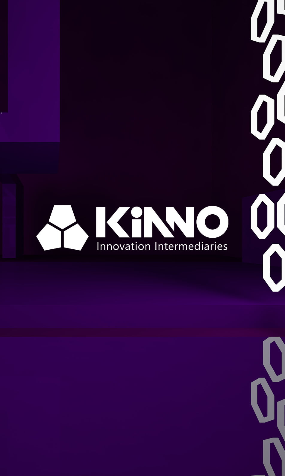
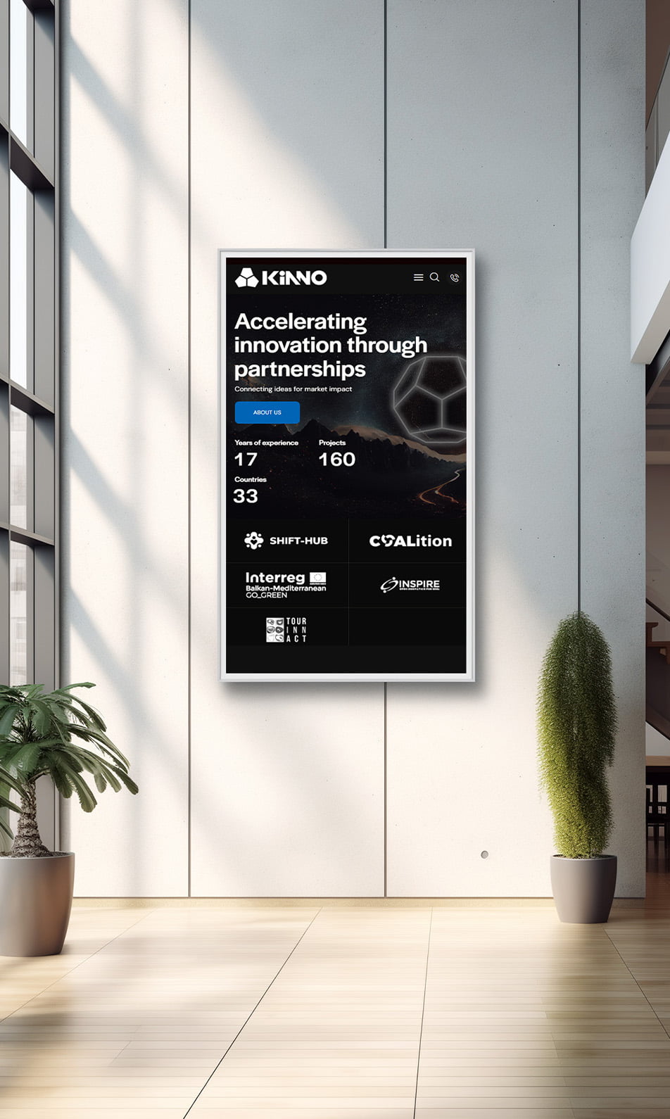
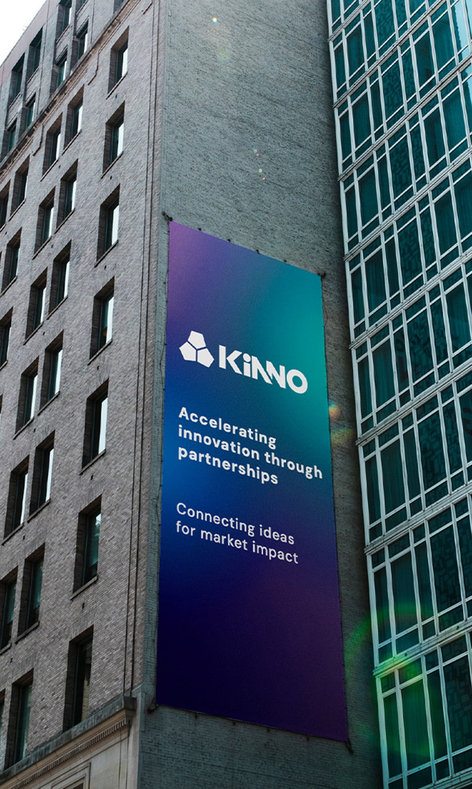
KiNNO Innovation Intermediaries enhances innovation by supporting ecosystems of early- stage SMEs, Research and industry players and public sector

Challenge
When Kinno engaged The Design Agency for a rebranding initiative, they aimed to refresh their brand identity without changing their established name. The goal was to capture their evolving values and better connect with the B2B audience.
The new logo was crafted with clean lines and a balanced color palette, representing growth and reliability—key elements for standing out in the competitive B2B landscape. Through these changes, Kinno now embodies a fresh, compelling identity that resonates with their target market while staying true to their original name.
Goal
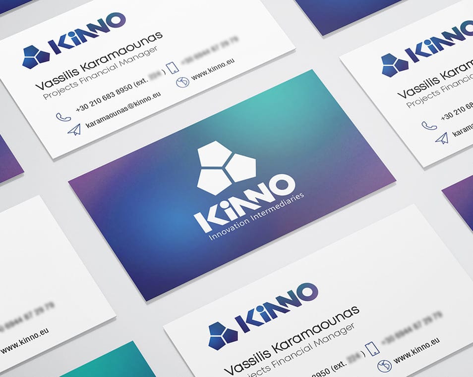
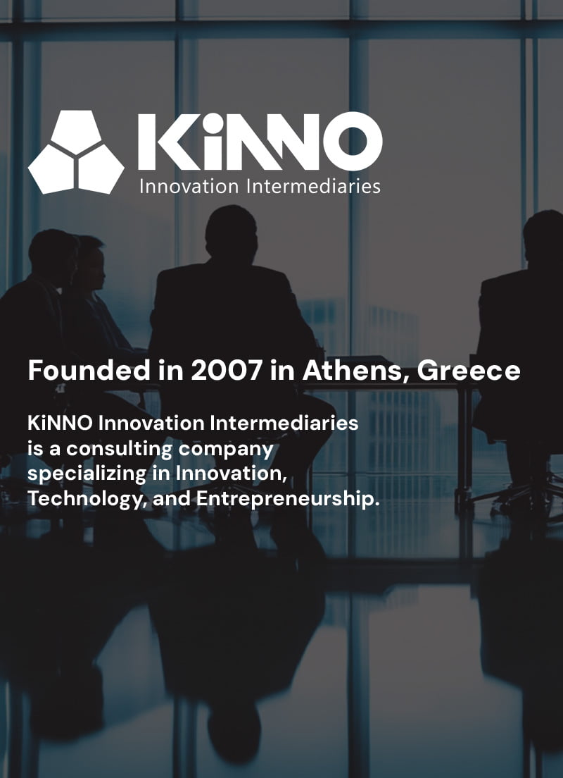
At the center of this transformation is the updated logo, featuring a dodecahedron—a twelve-sided geometric shape representing complexity, balance, and interconnectedness. This form was carefully chosen to reflect Kinno's multifaceted services and adaptability, symbolizing the intricate yet cohesive solutions they provide to their clients.
The color palette was just as intentional. Blue and purple were selected for their distinct associations within the business world. Blue communicates trust, reliability, and calm—qualities that appeal to B2B clients looking for dependable partnerships. Meanwhile, the addition of purple introduces a layer of creativity and forward-thinking, aligning with Kinno’s vision as an innovator. This dual-tone palette captures a balance of stability and boldness, setting Kinno apart in a competitive industry.
Result
With the updated logo and refined color scheme, Kinno now has a brand identity that not only resonates with their target market but also strengthens their positioning as a leader ready to navigate the complexities of today’s B2B landscape.
Empowering B2B Partnerships with Vision, Reliability, and Expertise

Empowering B2B Partnerships with Vision, Reliability, and Expertise
