Designing a Logo for Your Brand: A Step-by-Step Tutorial
Logos are oftentimes the most recognizable elements of a company and we know how to do it. They take very little space but can convey the company’s vision and values. The process of creating one requires some thought and knowledge. Discover how to create a logo in this tutorial by our expert designer. About the author: Omri Avraham, Visual Designer @ Elementor

Omri is a Visual Designer at Elementor’s Brand Design Team. He loves Nostalgic-related content and practicing lettering and calligraphy.
A logo is the symbol of your brand and while it doesn’t take up too much space, it packs a powerful punch.
Your logo needs to be visible everywhere you go — both online and in the real world. It needs to be visible on social media, videos, email signatures, physical products, and more.
Think about a brand like Apple. Sure, its products are very recognizable. But as smartphones and computers begin to look more and more alike, its logo will remain a completely unique and easily recognizable identifier for the brand.
But don’t be mistaken — logos aren’t just for big faceless companies. Every business, and even an individual, that wants to stand out and promote brand awareness, needs a logo.
Creating a logo isn’t a straightforward, easy process, however, and it relies on many factors from fonts to colors and more. Let’s discover how to create a logo in this step-by-step guide.
Why Does Your Brand Need a Logo?
Doing business these days requires brands to go beyond the borders of their four walls or, in the case of the web, the pages of their websites.
But the second you leave the security of your website, your brand risks being drowned out by everyone else clamoring for the spotlight. This is why your logo needs to follow you around everywhere you go — both online as well as in the real world.
- Social media
- RSS feeds
- Infographics
- eBooks and white papers
- Custom imagery with watermarks
- Videos with branded title cards
- Flyers and other digital or print resources
- Email signatures
- Business cards and other collateral
- Products
And if you do it right, you stand to reap some major benefits:
Help Your Brand Stand Out
Having a unique logo will, first and foremost, help your brand stand out more than those that use a boring stock logo, one that’s difficult to decipher or no logo at all.
Here are three great examples of unique frozen yogurt logos on Twitter:
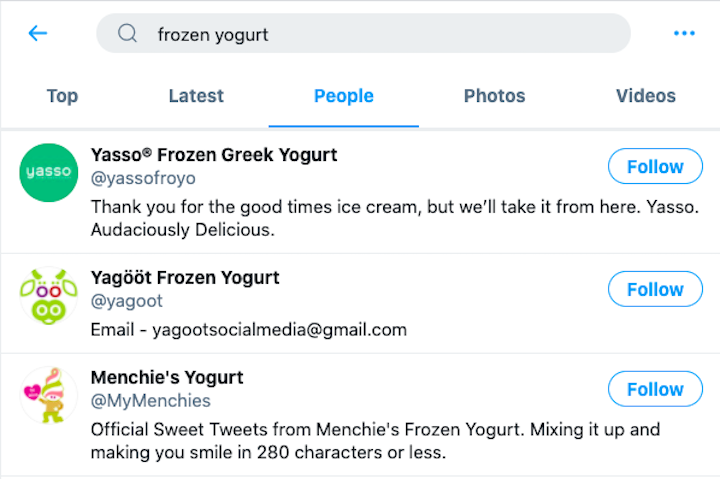
While they play around with similar colors, they each have a very distinct and distinguished style that makes each brand easy to spot among the pack.
Improve Brand Recognition
Keep in mind that the more you do to promote your brand outside of your website, the greater your visibility will be.
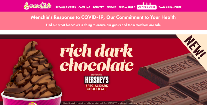
Here’s the Menchie’s logo on the company’s website:
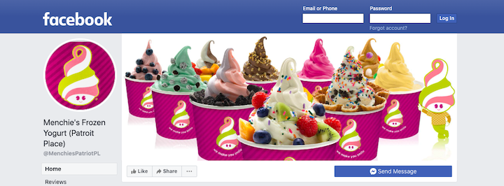
Here it is on Facebook:
And here it is on DoorDash:
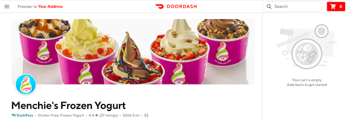
By consistently using the same eye-catching and memorable design from platform to platform, you improve brand recognition in the process.
Set the Tone for Your Brand
A strategically designed logo can tell someone a lot about your brand.
- What industry you work in
- What type of solutions you provide
- What kind of personality your brand has
So, a well-designed logo can do a lot to set the right tone for your brand. Just be careful about going overboard with it.
Take Pinkberry, for instance:
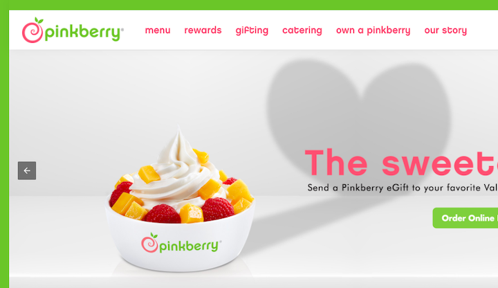
Its logo could’ve been a literal illustration of frozen yogurt or fruit toppings. However, the designer went with a more abstract concept.
The swirling symbol is reminiscent of swirled froyo. And the green leaf poking out of the top isn’t just to say, “Hey, we’re a healthy alternative to ice cream!” Together with the reddish-pink swirl, it looks like an apple.
How To Design a Logo: A Step-by-Step Guide
There are a number of things you want to accomplish when you design a logo for your brand. You want it to be:
- Unique, especially when compared to competitors’ logos.
- Well-designed, with good balance, layout and harmony.
- Easy to comprehend, even at a quick glance.
- Recognizable at any size.
- Clear about who you are and what you’re about.
And here’s how you’ll do it:
Step 1: Define Your Brand Identity
The logo is just one part of your brand imagery — the visuals that come together to convey a brand’s style and personality.
Take Steve Jobs, for example. This is him in 2007 announcing the iPhone:
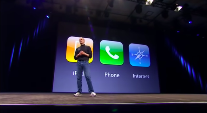
Jobs wanted to create a uniform — or visual identity — for himself. And so he commissioned fashion designer Issey Miyake to create the look for him.
The black turtleneck, blue jeans and white keds served as his trademark look for well over a decade.
And what did his wardrobe tell us? It told us that this man was obsessed with simplicity, clean design and attention to detail. It also hinted at a desire to create things that are future-proof and won’t go stale next week, next year or even 10 years down the line.
These are the kinds of things a logo, brand imagery and the all-encompassing brand identity should be able to tell us about a company or person.
In order to design a logo that will be perceived the right way by your audience, you’ll need to figure out your brand identity first. Start by asking yourself the following questions:
- How would you sum up what your brand does?
- Why did you choose your niche?
- What are the core values of your brand?
- What are 3 adjectives that describe your brand’s personality?
- What does your brand offer that competitors’ don’t or can’t?
- Who is your target audience? And why?
- What are 3 reasons your ideal customer or user will choose your brand over another?
- What is the main emotional response you want customers to have after working with or buying from you?
Write down your responses. Are there any patterns in the keywords you used? Is there a clear story here about who you are, why you do what you do and who you serve?
Once you understand this larger identity and your brand’s story, you’ll have a much easier time designing a logo that encapsulates it all.
Step 2: Competitor Research
While you want to design a logo that is uniquely your own, you should still familiarize yourself with the logos your competitors use.
Pay special attention to the logos of competitors that are doing well with your audience and those that are struggling. While a logo isn’t enough to convince someone to convert, it could have somewhat of an impact on it, say, if a design agency has a logo that looks like it was created in Microsoft Paint.
Look at 5 to 10 competitor logos and ask yourself:
- What do you like about each? Why?
- What do you dislike? Why?
- What would you do to improve their designs?
- What do their logos look like on other platforms — especially when they appear in smaller sizes?
There are some really good lessons to learn here. You also might find yourself feeling inspired after reviewing the competition’s logos.
Step 3: Brainstorming
Here are some things you can do to get your logo brainstorming session moving in the right direction:
- Go to Dribbble or Behance and have a look around.
- Do a search for “logo inspiration” on Pinterest.
- Visit some of your favorite websites and apps and check out their logos.
- Go for a walk in your neighborhood or downtown and take a look at the signage.
- Have a look at the products around your home or office that you use the most.
Save the logos you really like to a moodboard.
Pinterest is a good place to do this as it allows you to pin images you find on Pinterest as well as from the web to your board. You can also upload your own photos.
Here’s a logo inspiration moodboard Fivestar Branding Agency has built:
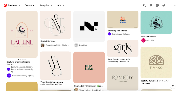
By saving all the logos in one place, it’s much easier to spot trends amongst them:
- Are there font types you like the look of?
- What style of logos are most common?
- Is there a color that really resonates with you?
Take a step back and really think about what you’re looking at and what this collection of logos is telling you.
Start sketching out a couple ideas (no more than 3) you think will work for you. You don’t need to do anything formal. Just rough black-and-white sketches for now.
Step 4: Choose Your Type of Logo
This is the part of the design exercise where you figure out what sort of structure your logo should have.
The goal is to choose a structure that you not only like the look of, but that makes sense for the kind of company you’re running as well as its values.
Here are the most common types of logos to choose from:
Monogram
This is the monogram logo for American Education Services:
Monogram logos contain only the initials or the first letter of a brand’s name.
This is useful for brands that have really long names and are otherwise too difficult to fit within the small space of a logo. You can also use a monogram if your acronym is more well known than the full name (like ASPCA instead of the American Society for the Prevention of Cruelty to Animals).
Wordmark
This is the wordmark logo for Friendly’s:
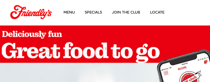
Wordmark logos contain the full brand name and nothing else.
This is useful for companies that want to use distinctive typography to tell people a bit about the company and what it does.
In the case of Friendly’s the retro cursive style lets people know one of two things — that either this is an old brand or it’s an ice cream shop that wants to make customers feel like they’ve stepped back in time. In this case, it’s because Friendly’s has been around since 1935.
Pictorial
This is the pictorial mark for Lululemon:
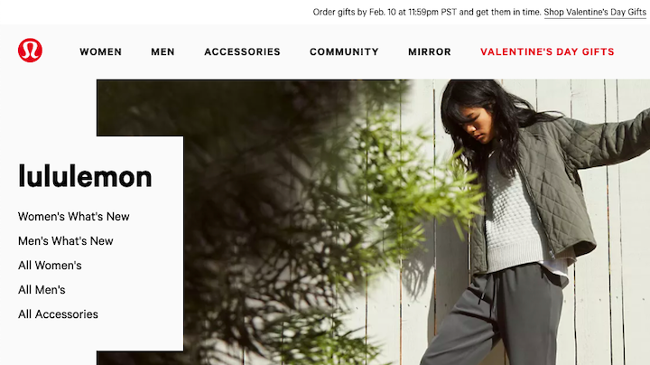
Pictorial logos only contain a symbol or icon.
This is useful for companies that sell products where the symbol can snugly fit within the design without distracting users. You can also use it on the website and social media to add small branded touches.
Combination
This is the recently redesigned combination logo for Burger King:
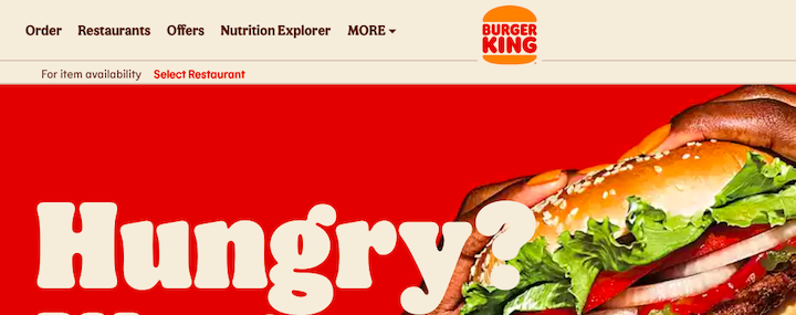
Combination logos contain both a wordmark (or monogram) and symbol.
There are many ways in which you can play around with this, but the choices you make should, again, reflect the overall style and offering of your brand.
Where you place the symbol and the direction in which you lay everything out can send different signals. For instance, a taller combination logo may feel stronger and more imposing than one that’s horizontally aligned. And the size of the symbol compared to the text will also send a different message.
Mascot
This is the mascot logo for Mailchimp:
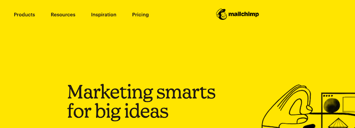
Mascot logos may be pictorial marks or combination logos. It all depends on how recognizable your brand’s mascot is or how pervasive it will be throughout your marketing.
This type of logo is similar to a pictorial mark in that you can use the symbol to follow users around. The main difference between a mascot and pictorial, though, is that a mascot is meant to create a more lighthearted and fun atmosphere.
Abstract
This is the abstract logo for Adidas:
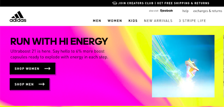
Abstract logos may contain only a geometric symbol or a combination of words and a symbol. However, the graphical element within the logo must not be a realistic portrayal of something (like Mailchimp’s monkey).
It must be an abstract concept related to the brand or a particular element they or their products are known for (like Adidas’s stripes).
This is useful for companies that make cutting-edge products or provide game-changing services. If it’s difficult to sum up what you do with a pictorial mark, but don’t want to rely solely on the company name, this is a good option.
Emblem
This is the emblem logo for MINI USA:
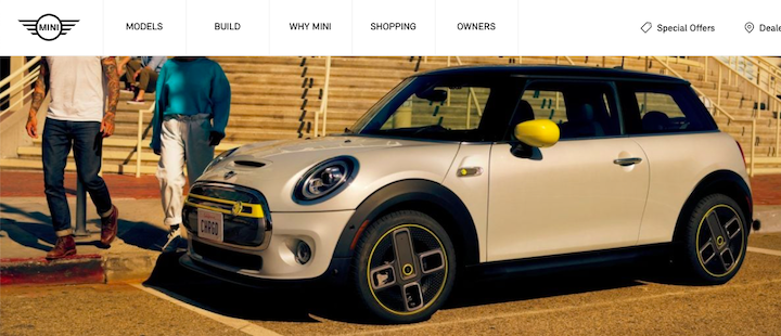
Emblem logos look like an actual emblem, shield, crest or label.
This is useful for companies that have strong, traditional values or have a long and well-known history. Emblem logos are commonly used by educational institutions and governmental agencies. Other kinds of companies can use it — just be mindful about the emblem shape you choose as each one conveys a different meaning.
Step 5: Choose the Right Typography
Once you’ve selected a logo style, you’ve already done most of the work to identify which kind of typography you should use.
Serif Fonts
Modern logos work well with traditional serif fonts. When a font looks as though it could appear on the pages of a printed newspaper or book, it lends a sense of authority and maturity to it. anatome’s logo is done in a modern style:

Serif fonts go well with modern logos which tend to be minimal in design, more traditional, and distinctive. These work great for brands with old-school values and traditions.
The apothecary above is a good example. The term apothecary is rarely used today, and on top of that, the fact that it says London Apothecary makes it clear that this brand tries to stand out by promoting traditions and old-school values in modern times and this particular font goes a long way in helping to promote this sense of authority.
Sans Serif Fonts
Classic logos work well with very simple sans serif fonts. Basically, you want a font that doesn’t have a time or place attached to it and one you could realistically use for decades. Bank of America’s logo is done in a classic style:
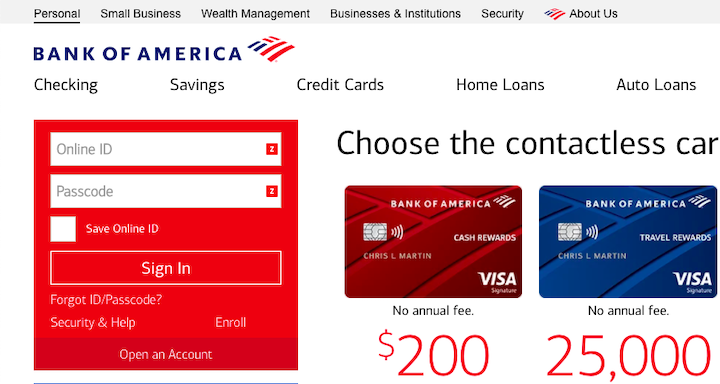
This Sans Sarif logo would be appropriate in any era, be it the 50s, the 80s, or now. It creates a sense of continuity, stability, and security and it evokes trust.
Monospace Fonts
Monospace fonts display characters within the same width and are designed to make them easier to read, and more identifiable on their own.
The ISSS 2019, which deals with space, has incorporated the Roboto Mono font to make the letters stand out in its circular logo.
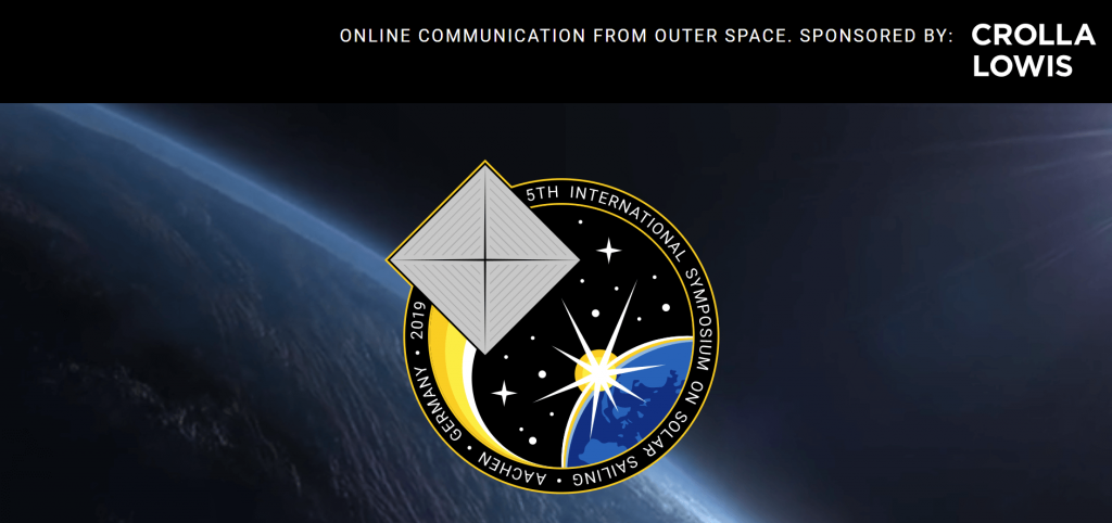
Using a monospaced font provides the benefits of easy alignment and readability which are especially helpful if the logo itself is small. On top of that, since it has been used in programming to make it easier to identify characters in long lines of code, it can perhaps be especially relatable to logos of companies that deal with computers or technology.
Handwritten Fonts
Hand-written or hand-drawn logos will obviously need to use a cursive or curly font. Which one you choose depends on how formal you want your brand to appear. A more traditional cursive will give your brand a buttoned-up look while a loose handwritten style will feel more relaxed and open.
The Sydney Hotel’s logo is done in a hand-drawn style:

These work great for brands that want to convey a sense of warmth and friendliness — like the hospitality example above. Hand-drawn logos also work well for solopreneurs and entrepreneurs who want to make their logo feel like a handwritten signature, just one that looks nicer than the typical mess of scribbles we see in the real world.
Display Fonts
Display fonts are a fairly broad category that incorporates miscellaneous fonts that are printed and displayed using a large font size. These can be incorporated into the logo, to create unique logos that stand out.
SpaceX’s logo is a good example of a display font with elements of futurism. This particular logo uses geometric shapes and unconventional letters:

Perhaps, in this case, the term display font is an understatement. SpaceX’s logo is clearly and proudly displayed on their rockets, for all to see from far away.
For technology and science companies that display their logo everywhere (NASA, Boeing, etc.) display fonts are particularly alluring.
Step 6: Choose Your Logo’s Colors
Now, color is one of the critical parts of one’s brand imagery and identity. So, you likely already have a color palette chosen for your brand.
But how do you decide which colors to include in your logo, if any?
Color psychology teaches us that color impacts the way people view or respond to things. Take bright green, for instance. When used in the Home Chef logo, it suggests that their meal prep offerings are healthy:

Leading companies have long known about this and that’s why most of their logos are designed with one of these primary colors:
- Green (health, eco-friendliness)
- Blue (stability, safety)
- Purple (quality, authenticity)
- Red (activity, excitement)
- Orange (energy, extroversion)
- Yellow (optimism, friendliness)
Don’t believe me? Canva rounded up logos from some of the top companies around the world. Here’s where their logos fall on the spectrum of color:
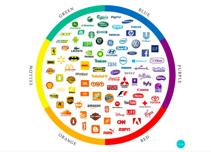
So, start simply. Zero in on the number one emotion you want people to feel or adjective you want them to associate with your brand. Then, identify the color that tells that story at a glance.
Step 7: Create Your Logo
At this stage, all the research and planning is done. Now, you need to actually design the logo.
You have a few options:
- Design it from scratch with Illustrator.
- Use a logo maker like Canva, find the right template and then customize the design.
- Use a logo maker and use one of the suggested options as is.
Regardless of how you go about it, your next steps will be the same:
Step 1: Export the Logo
You never know what kind of device or how large of a screen your website will show up on, so your logo should be in a scalable format. EPS, AI and SVG are the best vector file formats for logos.
Normally, WordPress won’t allow you to upload any of these formats to your website. However, you can install the SVG Support plugin, which will allow you to use an SVG logo.
Step 2: Size It for WordPress
Here’s what WordPress wants:
- Up to 256 MB
- 180 x 60 pixels

While WordPress’s Customizer settings are very limited when it comes to adding a logo to your site, Elementor Pro users can make more adjustments with the Site Logo Widget.
With this feature, you can adjust your logo’s:
- Width
- Max width
- Opacity
- CSS filters
- Border type
- Border radius
- Transition duration
- Hover animation
Oh, and if you want to have a little fun with your logo, you can make it animated with Elementor, too.
Step 3: Save It To Your Style Guide
Once your logo is designed, exported and uploaded to your website, it officially becomes a part of your brand imagery. And so it also needs to be added to your web design style guide.
In addition to including the logo as you designed it for your site, don’t forget to include alternative versions as well. You can see some examples of how other company’s style guides handle it.
Essentially, you want to create options for different color backgrounds, inverted color schemes, as well as different logo orientations.
Common Logo Design Mistakes to Avoid
The logo is a critical part of your branding. So, you need to get it right.
To help you avoid some of the pitfalls, here are the most common mistakes we see in logo design:
- The logo is too generic and looks like a knockoff of a stock icon or graphic you see everywhere.
- It looks too much like another company’s logo which leads to confusion.
- It’s too literal (like a hammer for construction) and comes off looking amateurish.
- It’s too simple and boring.
- It’s too complicated or busy so it’s hard to tell what it’s supposed to be.
- It’s not scalable and sometimes looks grainy and poorly made.
- It doesn’t tell a story or convey any personality.
- It tells the wrong story and sets the wrong tone for the brand.
There’s a lot on the line when it comes time to design a logo for your brand. So, be careful. Use the 7 steps outlined above, to slowly but surely strategize what each part of your logo should look like and know exactly why you’ve made those design choices.
Create a Logo and Make Your Brand More Recognizable
While you may think that creating a logo is a fairly straightforward process, it is not. With so many logos out there, some thought is required into creating one that’s truly unique and in line with your brand’s vision.
There are certain choices relating to the type of logo, appropriate colors, and complimenting fonts that you should take into consideration before you start making one.
After all, your logo will be visible everywhere — from email signatures, stationery items, on your products, ebooks, videos, and maybe even rockets!
So don’t dilly-dally, and make sure you begin your journey to creating a long-lasting, memorable and unique logo.
