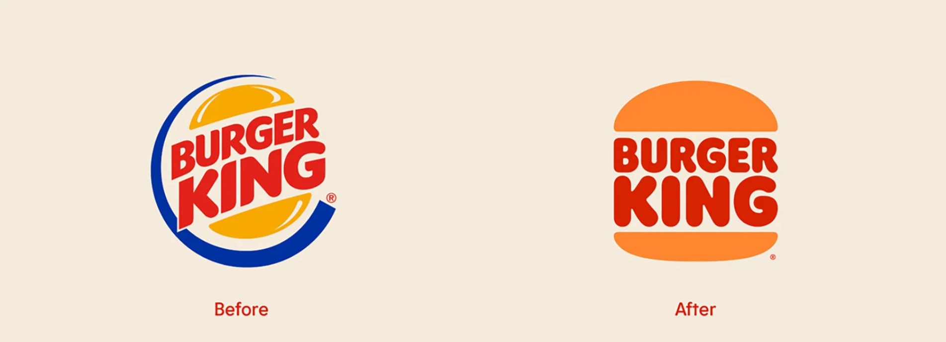
Burger King unveils new logo making it its first rebrand in over 20 years
burger king has unveiled a new brand identity, marking its first rebrand in over 20 years. the announcement signals a commitment to digital-first expression and recent improvements to taste and food quality, through the removal of colors, flavors, and preservatives from artificial sources from menu items, as well as an ambitious pledge to environmental sustainability.
‘design is one of the most essential tools we have for communicating who we are and what we value, and it plays a vital role in creating desire for our food and maximizing guests’ experience,’ raphael abreu, restaurant brands international head of design at burger king says. ‘we wanted to use design to get people to crave our food; its flame-grilling perfection and above all, its taste.’
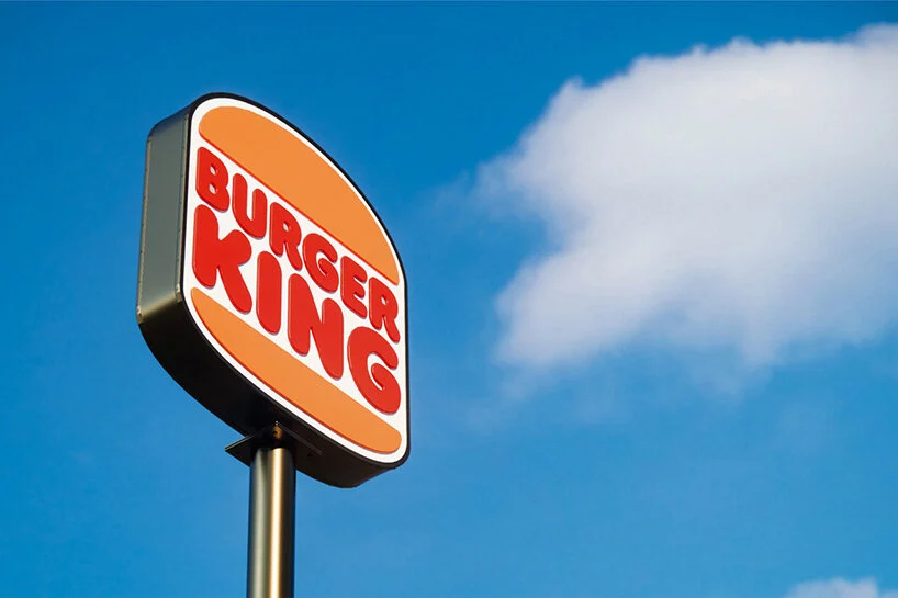
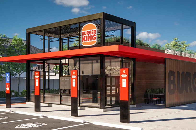
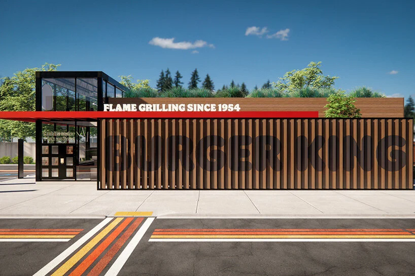
burger king’s new brand identity has reimagined every design element to better reflect the brand’s food journey while capturing its unique characteristics: mouthwatering, big & bold, playfully irreverent and proudly true. the new minimalist logo seamlessly meets the brand evolution of the times and pays homage to the brand heritage with a refined design that’s confident, simple and fun. the selected colors are rich and bold, inspired by burger king’s flame grilling. a new font was created, inspired by the rounded and bold BK food.
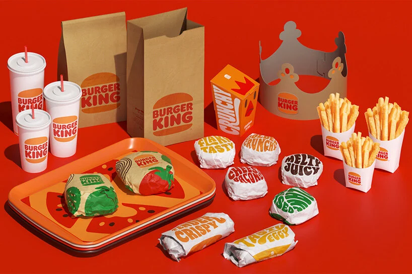
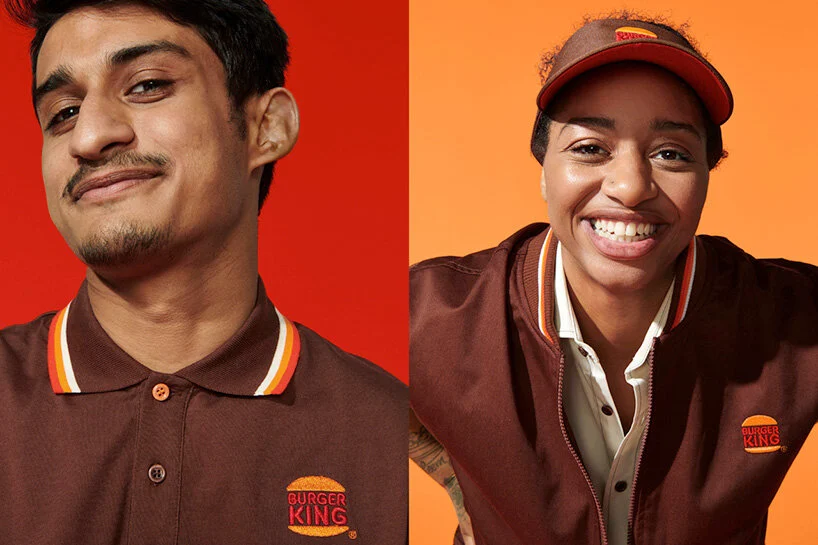
guest will start seeing the new visual identity starting at the beginning of 2021. employees will endorse the new uniforms while the new packaging will showcase the new logo together with playful illustrations of the ingredients.
