BBC unveils new logo after viewers said previous one was old-fashioned
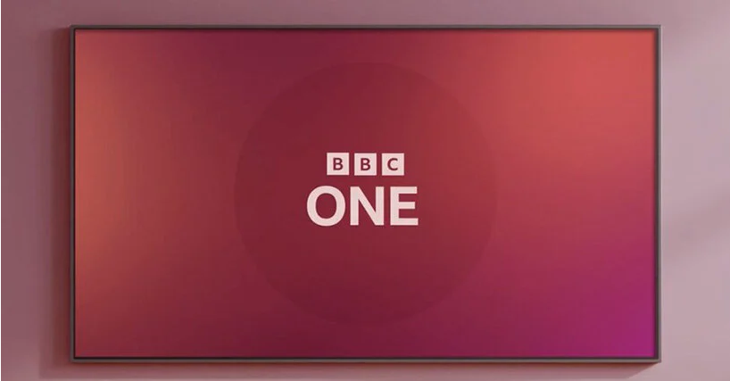
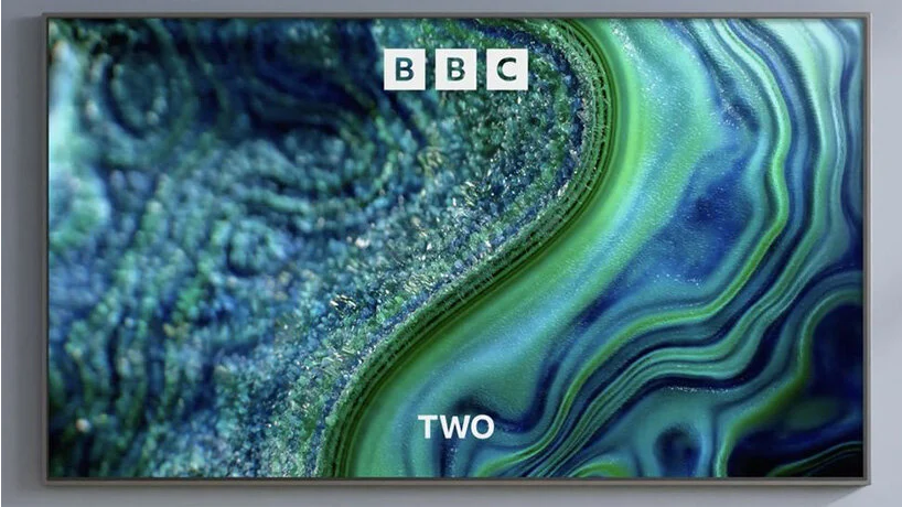
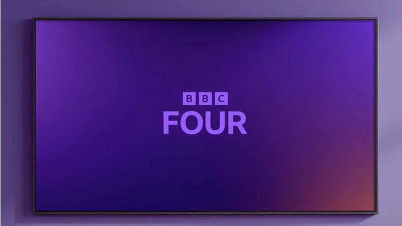
BBC has unveiled an updated version of its world-renowned three blocks logo. featuring a wider space between them and a new font, the UK’s national broadcaster said this new look was motivated by their audience who claimed its services looked old-fashioned and out of date.
‘our research tells us that audiences think some of our services look old-fashioned and out of date,’ BBC explained in an article. ‘they want a modern BBC that is easier to use and navigate to find the content they love and enjoy. the more content people find that they love, the more they will get from the BBC.’
over the coming months, BBC will be updating all aspects of its services through simplified layouts and graphics. iPlayer and sounds will be the first to change, followed by news, weather, sport, and bitesize. the new logo will also feature the corporation’s own reith font named after the BBC’s founder, which will replace gills sans. to continue with the blocks, news and weather will have new symbols made of these elements placed at different angles.
‘as we update our digital services, it makes sense to modernize how we present them too,’ continued the BBC’s chief customer officer kerris bright. ‘updated, recognizable colors, logos and graphics will identify each service and help improve navigation between them.’
like with most logo updates, the internet is not praising the revamped image. people have taken to twitter and reddit to communicate their thoughts. on reddit’s CrappyDesign, a user said that ‘as the BBC logo is 3 squares, I can understand the thinking behind the design – using 3 rectangles for everything so that’s it’s all uniform. but no, just no. I thought this was a joke at first – the iPlayer one is just laughable.’
another user commented: ‘although done much better elsewhere, I can see the rationale for the iPlayer logo, with the negative space play button. however, it appears they couldn’t find a solution to use this technique on the others so just resorted to plonking rectangles together to represent said symbol. the result, a incoherent poorly executed mess. although, I’d be interested to see these deployed with some motion graphics/intro sequences.’
