10 Practical Web Design Tips for Beginners
The job of a web designer is to use their creative instincts to craft memorable and functional websites. And thanks to the power of modern-day software, we have all the tools we need to turn even the wildest ideas into reality.
But being a web designer comes with a lot of responsibilities, too. Brands rely on us to create websites that will help them make a good first impression on users and increase their conversion rates. And as a beginner, you probably have a lot of questions. You want to know what elements a site needs to have, how to provide a good user experience, which style is the best, what features you must not overlook, and which design software to use, among others. The important role you have in the website development process can sometimes make you feel stressed and confused about how to use your skills to help a brand that hired you.
In this article, we will walk you through some of the most useful web design tips for beginners. Even if you have some practical experience in web design this guide could still be of use to you if you ever find yourself stuck in a rut. We will share useful advice that will help you navigate the exciting world of web design and become a better designer.
Draw Inspiration from Other Designers
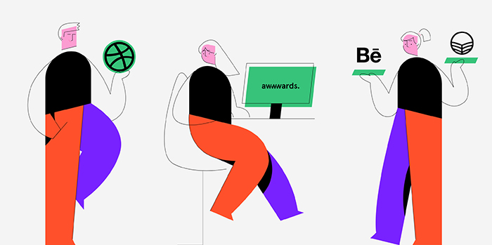
When you’re only just starting your web design career, you may find it difficult to jump straight into a project. Just thinking about all the work that’s to come can be overwhelming so you end up not knowing how or where to begin. To kick yourself back into gear and be more effective, we’d recommend you explore the works of other designers. You won’t copy their projects, of course, but their creativity is likely to ignite yours. While you browse their portfolios, ask yourself what it is that you like about their work. Do their projects reflect the values and convey the messages they are supposed to? Or is there something you would do differently? What about the colors? Do you think they match the vibe of the site and the character of the brand? While thinking about all this, your creative juices will inevitably kick in and you’ll probably feel inspired to get back to working on your own project.
Choose the Right Web Design Software
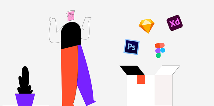
When you’re new to any field of work, it’s hard to know which tools to use to achieve the desired result. There is hardly ever an all-in-one solution, and web design isn’t any different. There are several feature-rich software solutions on the market, but Photoshop is probably the most popular of them all. We’ve included it in this list because most creatives are already familiar with it and have used it in the past. But if you’re starting from scratch and you’ve never used design tools before, it’s best to go with Figma, Sketch, or Adobe XD. All three are more web-design-oriented than Photoshop and are guaranteed to make your job a lot easier. And you don’t have to limit yourself to using just one. Sometimes it’s best to combine the features of several software programs to create unique and beautiful websites.
Explore Different Types of Design
As a young designer, you may feel pressured into finding your own style. Something that will set you apart from others. But you should know that a specific visual style isn’t something you can come up with overnight. It makes no sense tormenting yourself with that early on in your career (or ever, really). Your style will evolve naturally with time and practice. And you should try lots of different styles in order to discover what you like and why. Sometimes our styles inevitably have to change a bit depending on a project and the demands of a brand we’re working with. So while you browse the portfolios of other designers, make a selection of the works you really like. Try to figure out what is it about them that caught your eye, why those specific projects aesthetically please you more than others, and work from there. Make it your first goal to implement the features you like into your own projects and then tweak them to your taste. And if you ever start feeling that the style you decided upon no longer excites you, change it up! Never stop exploring and don’t be afraid to implement new techniques and styles into your work.
Understand Web Design Basics
Creating beautiful and functional designs takes preparation and research. There are lots of things you need to be mindful of, such as the audience you’re creating the project for. Or the color palette that will best suit the brand you’re working with. You also need to think about the layouts, responsive grids, typography choices, interactions, and imagery you want to use in a project. There are a lot of articles on the web that present the basic principles of web design, but we would recommend starting with Google’s Material Design. Even though this website is dedicated to Google’s unique style, it offers a detailed overview of the things you shouldn’t lose sight of while designing. Other great resources include Webflow and Smashing Magazine. Vincent Xia and Erik D. Kennedy also wrote helpful articles on the subject, so make sure to give them all a read to ensure your work is functional, intuitive, and that it meets the needs of your audience.
Pay Attention to Typography
Typography is more than just a tool that conveys messages. It is one of the most important web design elements that will, in most cases, have a huge impact on your overall project. Depending on their shape, size, color, and weight, typefaces have the power to add a variety of different contexts to your design. What you need to do is ensure they all have the same feel as the featured imagery and that they suit the purpose of a website. For example, if a website is dedicated to hand-made, elegant products, the accompanying fonts need to give off the same vibe. And when it comes to deciding on the number of different typefaces to use per project, we’d recommend going with maximum two or three. If your main font is a hand-written one with lots of curvy serifs, pair it with simpler typefaces. Some font combinations work better than others, so try out several of them until you find the one that best compliments your project. And if you’d like to read more on the subject of typography, check out Toptal’s comprehensive typography guide.
Keep Your Design Simple and Intuitive
While browsing the web, you’ve undoubtedly stumbled upon some mind-blowing designs and wished to create something just as striking. But before you start, you should know that not all good looking websites exemplify good design. A lot of designers often use too many colors and place meaningless elements on pages just to give their project a wow-factor. But the truth is, such work isn’t always adequate. If users can’t navigate a site with ease and quickly find what they’re looking for, they will leave without converting no matter how appealing your content may look.
The key is to start small and to slowly craft a sensical piece of work. Think through every single aspect of your website and how people will browse it. While designing, keep the KISS (“Keep it simple, stupid”) principle in your mind at all times. At the end of the day, simplicity really is one of the key principles of design. It is typical of designs that have the best impact on users and score the highest conversion rates, so you should keep your work clean and unburdened by unnecessary complexities.
Don’t Overthink It
Once you’ve covered all the basics, just start creating. As we mentioned earlier, you should try out different styles and explore the works of other designers until you can settle on what you would like to make. You can even recreate the projects you’ve particularly liked. This is a great practice for beginners because you know how the end product needs to look and it’s up to you to replicate it. Of course, you shouldn’t present that work as your own. This kind of exercise is exclusively for honing your skills, nothing else. The more you work on these types of projects, the more your confidence will grow, and you’ll soon feel ready to make your own design from scratch.
Get Feedback and Learn from It

Getting feedback from the people whose opinion you value can positively impact your work. Hearing how they perceive it and whether or not they find it simple and intuitive will help you make a better end product. Plus, constructive criticism can help you not only improve a particular project, but also grow as a designer. So don’t be afraid to ask for other people’s opinions. Run your work by designers with more experience and regular audiences alike to get both the experts’ thoughts and to understand how your project appeals to users. If you get some negative reviews, don’t let them discourage you. Use them as guidelines that will help you perfect your skills and fuel you to create even more captivating projects in the future. Fabricio Teixeira wrote an excellent article that will help you better understand and deal with feedback.
Never Stop Learning
Always keep learning. No matter how much experience you may gain over time, there are always ways to grow, new skills to master, and techniques to discover. Inspiring designers are everywhere around you and so are countless web resources that contain a wide assortment of all things web design.
To learn new design skills or perfect the ones you already have, attending online courses is always a good idea. Explore Memorisely, Treehouse, Interaction Design Foundation, HackDesign, and SkillShare to find what interests you the most and start learning.
If you are a fan of podcasts, give a listen to UI Breakfast, Dollars to Donuts, and Inside Intercom. For more, check out our article on inspiring design podcasts that are educational and entertaining at the same time.
As for books, UXPin offers a collection of practical guides on web design.
And lastly, you can find numerous useful video channels on YouTube, such as DesignCourse, Unfold, Yes I’m a Designer, Jesse Showalter, and Learn UI Design. To understand the importance of the mobile design experience, take a look at Luke Wroblewski’s lecture. Intel Software has shared a video teaching you how to communicate primary actions to your users, while Optimal Workshop has a video of Julie Grundy’s useful talk on how to design an effective form.
Have Fun
No matter the project you are working on, remember to always have fun. That way, you will always feel inspired to experiment and push your own boundaries. And just like work, learning can be a lot of fun, too. There are websites that work like games that actually help you test and train your eye for small details. Both Can’t Unsee and UX Academy are excellent interactive resources that will help you develop your design skills and also see things from another perspective.
Conclusion
Now that you are familiar with the key elements of good web design, go ahead and start creating. Don’t be afraid to explore various tools and styles, try out different techniques, play with elements and tweak their appearance as many times as you want until you’re fully content with what you see.
Start small until you fully figure things out. Work tirelessly on perfecting your skills and never stop learning. Stay open to constructive criticism – you will become a better web designer because of it. And most importantly, have fun and start creating exciting, functional, and easy-to-browse websites.
